

When we pick up a juicy brush and drag color across paper, we’re not just moving “paint” — we’re working with tiny particles that behave like characters in a story. Some are bold and staining, some settle softly like desert dust, some glow like stained glass, and others fade quietly if left in the sun too long.
Understanding the personality of each pigment can transform the way you paint. Let’s explore four essential characteristics — staining, granulating, transparency, and lightfastness — and then dive into a list of the Top 50 artist pigments, their common names, and pigment codes, so you can build your palette like a pro.
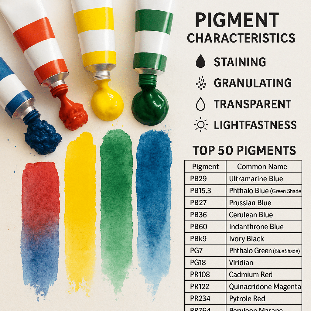
🧪 1. Staining vs. Non-Staining
Staining pigments are the clingy ones — once they hit the paper, they soak in and are nearly impossible to lift. Great for glazing, underlayers, and bold statements.
Pros: Brilliant intensity, great for layering.
Cons: Hard to lift or soften; mistakes are less forgiving.
Non-staining pigments sit more on the surface and can often be gently lifted or scrubbed away. They’re ideal for beginners or painters who like to “edit” as they go.
Tip: Use non-staining pigments for skies or subtle washes where you may want to lift clouds.
🌫️ 2. Granulating vs. Smooth
Granulation is all about particle size and shape. Granulating pigments are often made from mineral pigments — their larger, heavier particles settle into the paper’s texture, creating beautiful, organic patterns. Think of Ultramarine Blue’s signature speckled texture.
Pros: Adds texture and visual interest naturally.
Cons: Can be unpredictable on hot-press or heavily sized papers.
Smooth (non-granulating) pigments disperse evenly for flat, uniform washes. These are great for graphic shapes, clean layers, or illustration work.
🌤 3. Transparency vs. Opacity
Watercolor loves transparency — that’s what gives it that luminous, glowing quality. Transparent pigments let the white of the paper shine through, creating luminous layers when glazed.
Opaque pigments contain more particles or reflective materials, blocking light more. This isn’t “bad” — opaque pigments like Cadmium Red or Naples Yellow can be powerful tools for accents and contrast.
Tip: Glazing transparent pigments over one another creates luminous depth; opaque pigments are best in single, bold applications.
☀️ 4. Lightfastness
Lightfastness measures how resistant a pigment is to fading over time when exposed to light.
Excellent (I / ASTM I): Will remain stable for decades (e.g., Ultramarine PB29).
Very Good (II): Good performance, some slight fading over many years.
Moderate to Fugitive (III–V): Will fade significantly; often natural dyes or some bright fluorescents.
Always check lightfastness ratings when buying pigments — particularly for works you plan to sell or display. Some “beautiful” pigments (hello, Opera Pink) are heartbreakers long-term.
🧭 The Top 50 Pigments Every Watercolorist Should Know
Here’s a curated list of 50 of the most beloved, stable, and widely used artist pigments. I’ve included their standard pigment codes (as found on most artist-grade tubes) and their common names.
| Pigment Code | Common Name | Pigment Type |
|---|---|---|
| PB29 | Ultramarine Blue | Granulating, transparent |
| PB15:3 | Phthalo Blue (Green Shade) | Staining, transparent |
| PB15:1 | Phthalo Blue (Red Shade) | Staining, transparent |
| PB27 | Prussian Blue | Staining, semi-transparent |
| PB36 | Cerulean Blue Chromium | Granulating, opaque |
| PB35 | Cerulean Blue (Cobalt Stannate) | Granulating, semi-opaque |
| PB60 | Indanthrone Blue | Staining, transparent |
| PB66 | Indanthrene Blue | Deep staining |
| PBk9 | Ivory Black | Non-staining, opaque |
| PBk11 | Mars Black | Opaque, slightly granulating |
| PBk31 | Perylene Green (as black) | Deep staining, transparent |
| PG7 | Phthalo Green (Blue Shade) | Staining, transparent |
| PG36 | Phthalo Green (Yellow Shade) | Staining, transparent |
| PG18 | Viridian | Transparent, granulating |
| PG50 | Cobalt Green (Turquoise) | Granulating, semi-opaque |
| PR108 | Cadmium Red | Opaque, non-staining |
| PR209 | Quinacridone Red | Transparent, staining |
| PR122 | Quinacridone Magenta | Transparent, staining |
| PR254 | Pyrrol Red / DPP Red | Semi-opaque, intense |
| PR264 | Perylene Maroon | Transparent, staining |
| PR101 | Synthetic Red Iron Oxide | Semi-transparent, granulating |
| PR233 | Potter’s Pink | Transparent, strongly granulating |
| PV19 | Quinacridone Rose / Violet | Transparent, staining |
| PV23 | Dioxazine Violet | Staining, transparent |
| PV29 | Ultramarine Violet | Transparent, granulating |
| PV14 | Cobalt Violet | Transparent, granulating |
| PV15 | Ultramarine Violet Deep | Transparent, granulating |
| PO20 | Cadmium Orange | Opaque, non-staining |
| PO48 | Quinacridone Burnt Orange | Transparent, staining |
| PO73 | Pyrrol Orange | Transparent, staining |
| PO62 | Benzimidazolone Orange | Transparent |
| PY35 | Cadmium Yellow | Opaque, non-staining |
| PY40 | Natural Yellow Ochre | Semi-opaque, granulating |
| PY42 | Synthetic Yellow Iron Oxide | Semi-opaque, granulating |
| PY150 | Nickel Azo Yellow | Transparent, staining |
| PY154 | Benzimidazolone Yellow | Transparent |
| PY175 | Arylide Yellow (Lemon) | Transparent |
| PY97 | Arylide Yellow (Medium) | Transparent |
| PY3 | Hansa Yellow Light | Transparent |
| PY65 | Hansa Yellow Deep | Transparent |
| PR179 | Perylene Red | Transparent, staining |
| PR206 | Quinacridone Burnt Scarlet | Transparent, staining |
| PBr7 | Natural Earth Umber/Sienna | Semi-transparent, granulating |
| PBr25 | Permanent Brown | Transparent |
| PBr33 | Van Dyke Brown | Transparent |
| PBr41 | Transparent Red Oxide | Transparent, granulating |
| PBr29 | Mars Brown | Opaque |
| PW6 | Titanium White | Opaque, non-staining (used sparingly) |
| PW4 | Zinc White | Semi-transparent (mixing white) |
🧠 Tips for Building a Pigment-Savvy Palette
Start with single pigments. Multi-pigment mixes can be gorgeous, but single pigments give cleaner mixes and more control.
Balance staining & liftable. You’ll want some of each for different effects.
Include a few granulators. Ultramarine, Cobalt Green, and Potter’s Pink give texture naturally.
Check lightfastness before falling in love with that hot pink… (Opera Rose, I’m looking at you 👀).
🌟 Closing Thoughts
Pigments are the secret language of watercolor. Once you learn their quirks, you stop fighting your paints — and start collaborating with them. Whether you prefer the soft whisper of a granulating mineral or the bold shout of a staining quinacridone, every pigment has a role to play.
So next time you squeeze that tube, take a second to check the pigment code on the label. Behind that tiny “PR209” is a world of behavior waiting to be explored.
