
Composing the Quiet: A Painter’s Guide to Still Life Arrangement
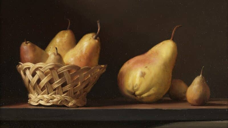
Still life painting looks peaceful from the outside… until you start arranging objects and suddenly feel like an interior designer hired by a bowl of pears with opinions. But composition is where the magic begins — the point where light, form, and intention find their footing before a single brush touches paper. Here’s a thoughtful […]
Inside My Watercolor Palette: Staining Brilliance, Subtle Granulation, and the Joy of Ceramic Wells
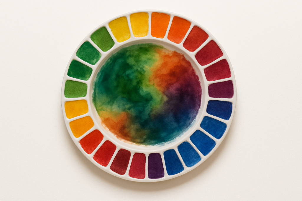
Subscribe A painter’s palette is a bit like a quiet confession — every color choice reveals something about how we see the world. Mine happens to be built on the luminous, syrup-rich flow of M. Graham watercolors, with a few well-chosen Daniel Smith granulators rounding out the texture side of things. I keep two palettes […]
The Essential Tools for a Plein Air Setup
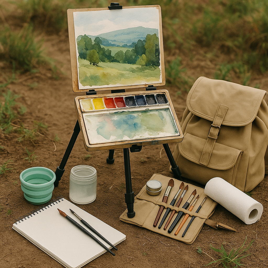
What to pack, why it matters, and how to keep your kit light and effective. There’s nothing quite like stepping outside with your brushes and letting the landscape dictate the story. Plein air painting forces you to make decisions quickly, simplify shapes, and chase that shifting light with a sense of urgency that studio […]
🎨 Giclée Prints: What They Are, How They’re Made, and What You Need to Make Them
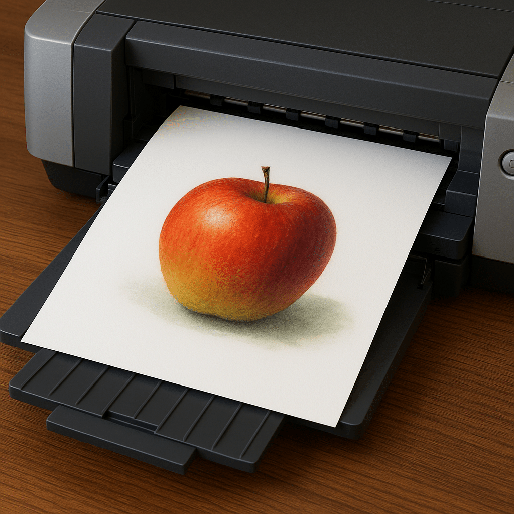
By Light Sculpture Studio What Is a Giclée Print? “Giclée” (pronounced zhee-clay) is a French term meaning to spray — a nod to the fine mist of ink used in high-quality inkjet printing. But not all inkjet prints are Giclée prints. A true Giclée is a museum-grade reproduction of original artwork made using archival […]
🎨 The Hidden Architecture: The Importance of Value and Compositional Sketches

Before a single brushstroke touches the final surface, the painter quietly constructs a foundation—an invisible framework of value and design that holds the entire work together. These early drawings, called value and compositional sketches, are not mere preliminaries; they are the architect’s blueprints of vision. I do not set up a still life for photography […]
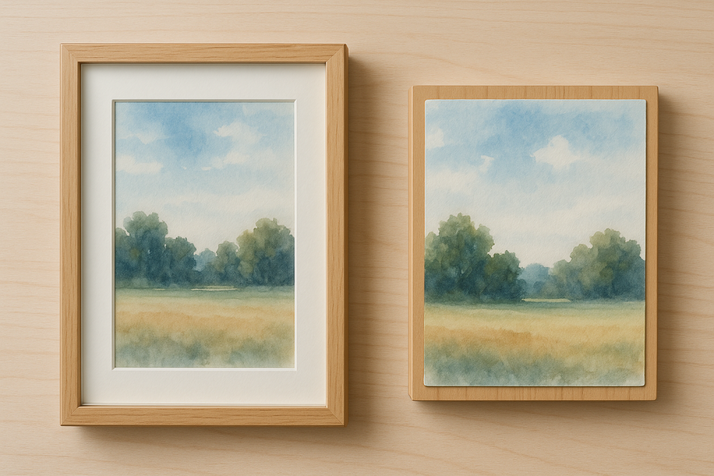
Framing the Light: Selecting the Right Substrate for Watercolor (Part 2)

Part 2: “Anchoring the Paper, Holding the Glow” When a water-based painting meets light and space, the choice of substrate becomes more than support — it becomes part of the work’s dialogue with its frame, its depth, and its display. Mounting watercolour on a rigid surface shifts the tradition of under-glass framing and invites a […]
Framing the Light: Protecting Watercolor with Glass and Varnish (Part 1)
A watercolor painting is, in many ways, a fragile miracle — a fusion of pigment, fiber, and water that remains luminous only because the paper holds light within its surface. Protecting that light means understanding how exposure, moisture, and time can alter the very chemistry of the work. Framing, though often treated as a decorative […]
The Language of the Brush: Classical and Modern Techniques for Realist Painters
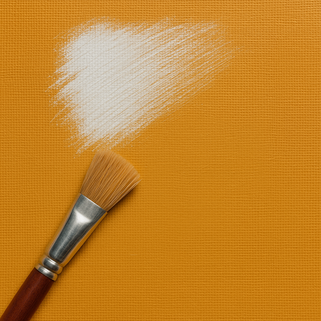
A brushstroke is more than a mark — it’s the signature of a moment. Whether working in watercolor’s translucence or oil’s sculptural depth, every technique is a way of speaking through touch. Mastering brush handling allows the painter to move beyond imitation into expression, where surface and light become inseparable. Below are essential brush […]
Caring for Your Brushes: Preserving the Soul of Sable
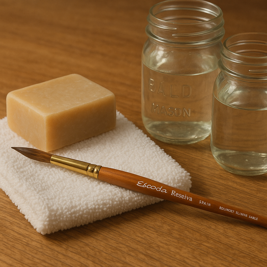
Good brushes are extensions of your hand — silent partners in every painting.And when you invest in fine tools, like Escoda Reserva Kolinsky sables, you’re working with living instruments that reward care and punish neglect. Proper cleaning and storage extend not only the life of your brushes but also their character — that delicate balance […]
The Art of Glazing: Watercolor vs. Oil Painting
Glazing in Watercolor Glazing in watercolor is the art of layering translucent washes to build luminosity and depth. Each layer interacts with the ones beneath it, creating subtle shifts in tone and color that cannot be achieved through a single application. Technique and Process:A watercolor glaze is created by diluting pigment heavily with water […]