A painter’s palette is a bit like a quiet confession — every color choice reveals something about how we see the world. Mine happens to be built on the luminous, syrup-rich flow of M. Graham watercolors, with a few well-chosen Daniel Smith granulators rounding out the texture side of things.
I keep two palettes in my studio:
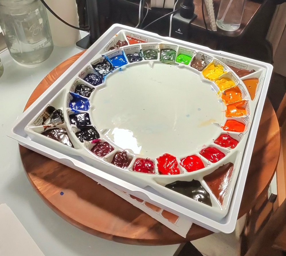
- The Large Quiller Palette – dedicated almost entirely to transparent, staining colors arranged for clean mixing.
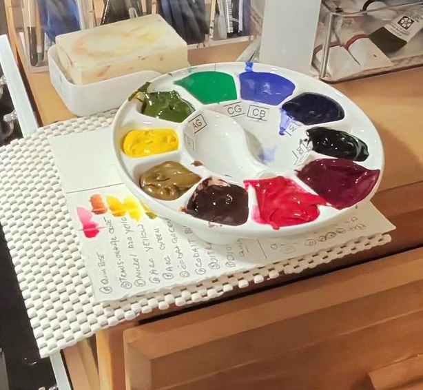
- The Granulating Palette – a smaller selection I reach for when I want earth, texture, or a bit of atmospheric drama.
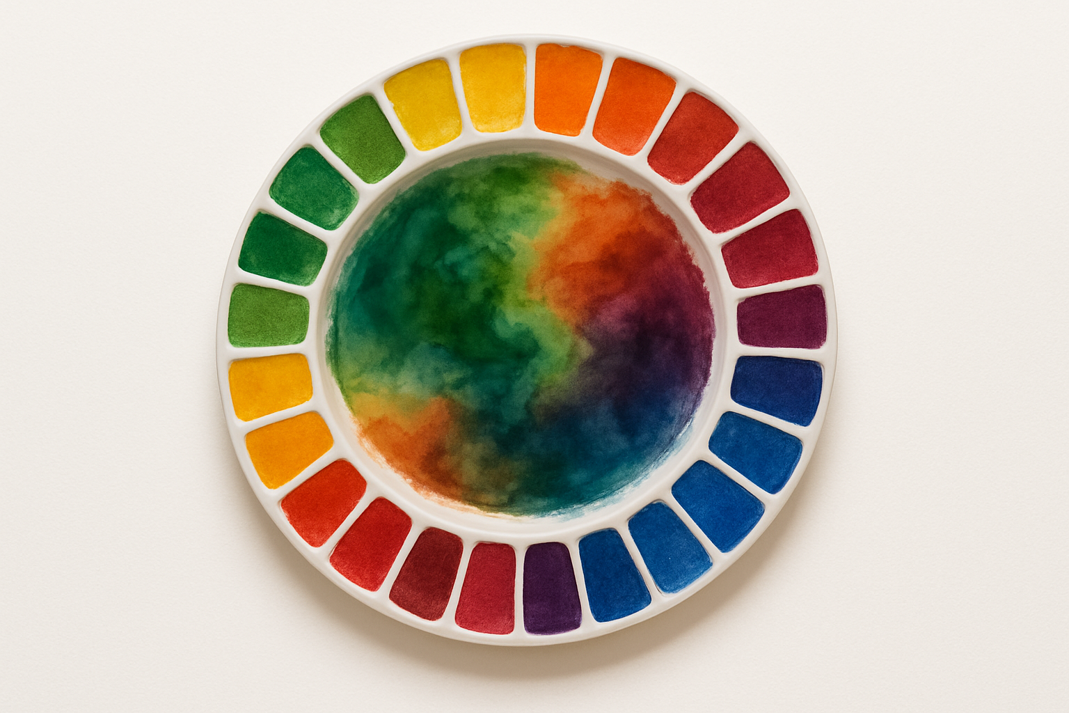
The backbone of my setup is the ceramic Quiller palette — cool, heavy, stable, and a joy to wipe back to white. It keeps mixes honest, allowing me to judge value and chroma without the shiny distractions of plastic.
Let’s take a tour.

Granulating Palette

Staining Palette
The Big Palette — Transparent, Staining, and Radiant
These are my workhorse colors — the dependable soldiers of the studio. They’re powerful mixers, beautifully transparent, and wonderfully predictable in a wash. Because they lift less, they let me build layer upon layer of controlled glazing without disturbing what’s underneath. That’s essential in the kind of work I do, where intention matters as much as intuition.
I lean on non-granulating, truly transparent pigments for a very specific reason: a huge amount of my painting involves multiple glaze stages and mirror-smooth transitions. When I’m capturing reflective surfaces — glass, silver, brass, copper, polished ceramics — granulation is the enemy. Any accidental texture can break the illusion of a clean highlight or softened shadow. Staining pigments, by contrast, glide into place and stay there. They let me coax form out of light rather than force it with texture.
This means my main palette has to behave like a precision instrument. Every hue needs to:
-
Flow cleanly in large washes
-
Glaze without lifting earlier layers
-
Mix predictably without unexpected granulation
-
Transition smoothly for reflection gradients
-
Hold saturation even after multiple layers
That’s why my palette leans so heavily toward the staining side of the watercolor world. Their reliability gives me the freedom to focus on sculpting reflective light — those delicate shifts from warm to cool, or that quiet edge where a silver rim bends toward shadow. When working with metals and glass, it’s all about finesse, not fireworks, and these pigments give me precisely that.
Below are the full, corrected names of the colors as they appear on my palette — the ones that make those transparent, luminous passages possible.
Greens
- Phthalo Green (Blue Shade) – M. Graham
- Hooker’s Green – M. Graham
- Sap Green – M. Graham
- Permanent Green Pale – M. Graham
Yellows & Golds
- Nickel Quinacridone Gold – M. Graham
- Azo Yellow – M. Graham
- Hansa Yellow Deep – M. Graham
- Indian Yellow – M. Graham
Oranges
- Azo Orange – M. Graham
- Scarlet Pyrrol (Pyrrole Scarlet) – M. Graham
Reds
- Quinacridone Red – M. Graham
- Pyrrol Red – M. Graham
- Naphthol Red – M. Graham
- Permanent Alizarin Crimson – M. Graham
- Maroon Peyrelene (Peyrelene Maroon) – M. Graham
Violets & Purples
- Quinacridone Violet – M. Graham
- Dioxazine Purple – M. Graham
Blues
- Ultramarine Blue – M. Graham
- Cobalt Blue – M. Graham
- Anthraquinone Blue – M. Graham
- Phthalo Blue (Green Shade) – M. Graham
- Prussian Blue – M. Graham
- Manganese Blue Hue – M. Graham
This lineup gives me everything from subtle natural greens to deep, moody shadows. Because they’re primarily staining and transparent, they play beautifully together without turning to mud — always a kindness to the painter.
The Granulating Palette — Earth, Texture, and Liftability
When I want foliage bark textures, atmospheric skies, or passages with subtle edges, I switch to this smaller tray. These colors come from both M. Graham and Daniel Smith; the latter is famous for granulation and earth pigments.
M. Graham & Daniel Smith Colors
- Transparent Yellow Oxide
- Transparent Red Iron Oxide
- Quinacridone Burnt Orange
- Quinacridone Rust
- Terra Rosa
- Transparent Brown Oxide
- Nickel Azo Yellow (Transparent Orange Oxide / Nickel Azo family)
- Cobalt Green
M. Graham Earths
- Raw Umber
- Burnt Umber
- Burnt Sienna
- Raw Sienna
This companion palette gives me granular, organic textures that the staining palette just can’t offer. I can soften, lift, or blend them with ease — perfect when painting stone, bark, rust, desert light, or any place where nature winks at us with uneven edges.
Why This Two-Palette Approach Works
Some artists build a single palette with every color they own. Mine is more… diplomatic. By separating staining/transparent colors from granulating/liftable ones, I get:
- Cleaner mixes with my transparent palette
- Stronger control over texture when I want it
- No accidental granulation sneaking into large washes
- Easier brush discipline (my granulating palette uses softer, rounder brushes)
Think of it like having a sports car and a 4×4 in the same garage. One gets you elegance and speed, the other grips the gravel roads with purpose.
The Ceramic Quiller Advantage
The circular layout encourages intentional mixing — complements facing, analogous colors grouped, temperature shifts visible at a glance. The ceramic surface:
- Keeps mixes smooth and predictable
- Doesn’t bead
- Lets me see the true value of a wash
- Cleans effortlessly
It’s like having a little porcelain discipline coach sitting by your side.
In the End…
This palette isn’t meant to be universal — it’s meant to be mine. It reflects the way I think about light, glazing, texture, and form. When I sit down to paint, I know exactly how these pigments behave, how they mix, and how they lift (or stubbornly don’t).
And that familiarity is what brings freedom — the freedom to focus on the subject rather than the paint.


