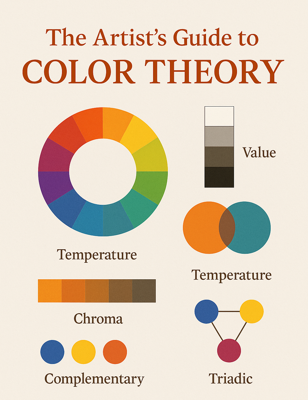
Color is one of the oldest languages in art. Long before artists mastered anatomy, perspective, or glazing techniques, they learned to speak in hue, value, and chroma. Whether you’re working in watercolor, oils, or digital, color theory acts as a compass — guiding you toward harmony or tension, subtlety or drama.
Think of it as the structure beneath the brushstroke: the quiet architecture shaping everything the viewer feels.
Why Color Theory Still Matters
Even with modern pigment science and digital tools, the core principles haven’t changed. Color still determines:
- Mood — A painting can whisper or thunder simply by shifting hue.
- Focus — Value contrast and saturation control the viewer’s eye.
- Harmony — Balanced palettes feel natural, intentional, and unified.
- Depth — Warm colors advance, cool colors recede (most of the time).
- Symbolism — Centuries of meaning are baked into color choices.
Understanding these principles lets you wield color with confidence rather than accident.
1. The Color Wheel: The Map of Hue
The modern color wheel organizes hues into relationships that help you make smart choices quickly.
Primary Colors
- Red
- Yellow
- Blue
They form the foundation. Everything else springs from here.
Secondary Colors
Mix any two primaries:
- Orange (red + yellow)
- Green (yellow + blue)
- Violet (blue + red)
Tertiary Colors
These are your nuanced in-betweens:
- Yellow-orange
- Red-orange
- Red-violet
- Blue-violet
- Blue-green
- Yellow-green
These create most of the subtlety in natural scenes — foliage, skies, fabrics, skin tones, reflections.
2. Value: The Quiet Power Behind Every Palette
Color grabs attention, but value does the heavy lifting.
Value is the lightness or darkness of a hue — and it determines:
- The structure of your composition
- The illusion of depth
- Where the viewer looks first
- How dramatic or quiet a painting feels
A painting with weak values will feel flat no matter how many gorgeous pigments you throw at it. Conversely, a monochrome value sketch can feel alive even without color at all.
If hue is poetry, value is grammar.
3. Temperature: Warmth, Coolness, and Emotional Pull
Every color leans warm or cool.
- Warm: reds, oranges, yellows
- Cool: blues, greens, violets
Temperature affects how the viewer feels and how space behaves within the painting. Warm colors advance; cool colors recede. Landscapes use this constantly: warm foregrounds, cool distant mountains.
Even within a single color, temperature shifts are powerful:
Ultramarine leans warm, while Phthalo Blue is cool. Cadmium Red is warm; Alizarin Crimson is cool.
4. Chroma: Saturation and the Drama of Intensity
Chroma is how pure or gray a color feels.
High-chroma colors feel energetic, youthful, and loud.
Low-chroma colors whisper, soften, and create atmosphere.
Balancing chroma is where artistic maturity shows up — knowing when to mute, when to brighten, and how to let the eye rest.
5. Color Harmony: Palettes That Sing
Here are the most useful color relationships:
Complementary
Colors opposite on the wheel (blue/orange, red/green).
Great for drama and contrast.
Analogous
Three neighbors on the wheel (yellow–yellow-green–green).
Soft, harmonious, natural.
Split-Complementary
A hue plus the two neighbors of its opposite.
Balanced tension without harshness.
Triadic
Three colors evenly spaced (red/blue/yellow).
Energetic but stable.
Monochromatic
One hue explored through value and saturation.
Elegant and serene.
6. Building a Functional Artist Palette
A well-planned palette lets you mix anything without mud.
A Core 12-Color Palette
- Warm + Cool Primary Pairs
- Ultramarine Blue (PB29) – warm
- Phthalo Blue (PB15:3) – cool
- Cadmium Red / Pyrrol Red – warm
- Alizarin Crimson / Quin Rose – cool
- Cadmium Yellow – warm
- Lemon Yellow – cool
- Essential Earths
- Burnt Sienna
- Yellow Ochre
- Neutrals
- Payne’s Gray
- Neutral Tint
- Convenience Mixes
- Sap Green
- Cobalt Teal or Turquoise
You get a full spectrum without chaos.
7. How Color Theory Influences Real Paintings
Warm Light → Cool Shadows
A classic landscape principle.
Cool Light → Warm Shadows
Common in overcast days, studios, and winter scenes.
Limiting Your Palette → Instant Unity
Three colors mixed intelligently beat 20 colors used randomly.
Value Contrast = Focal Point
Where your sharpest light meets your darkest dark — that’s where the eye goes.
Temperature Contrast Creates Mood
Think of Rembrandt’s warmth, or Whistler’s cool nocturnes.
8. How to Practice Color Theory (Practical Exercises)
- Paint a color wheel with your own pigments — learn their real personalities.
- Do a 5-value monochrome study — master value first.
- Create a warm/cool landscape using only two colors.
- Try a complementary pair painting — blue/orange is a classic.
- Do a desaturation study — push a color from vivid to gray.
- Make a “failed mix” chart — learn what creates mud.
These simple drills sharpen your instincts dramatically.
9. Thinking Forward: The Future of Color in Art
Modern artists are blending traditional theory with digital tools, spectral palettes, and experimental materials. We’re entering a time when painters can simulate glazes digitally, build custom pigment curves, or explore colors impossible before.
Color theory remains the foundation — but now we have new ways to explore it.
Closing Thoughts
Color theory isn’t about memorizing rules. It’s about widening your sensitivity — noticing the hidden temperature shifts in a sunrise, the low-chroma purples in a shadow, the high-value highlights that define form.
Mastering color gives you a richer visual life and a deeper artistic voice.
And every brushstroke becomes more intentional, more poetic, more alive.


