

Color is more than surface beauty — it’s the grammar of light.
For the realist painter, color theory isn’t an abstraction or a classroom exercise; it’s a living structure that gives form, depth, and temperature to what the eye perceives. Every hue is a choice, and every choice tells the viewer how to see.
In both watercolor and oil, understanding color means learning how pigments behave, how they interact, and how temperature, value, and contrast work together to create convincing form.
🎨 1. The Color Wheel: A Living Compass
At the heart of color theory lies the color wheel, a circular map that helps us visualize relationships between hues.
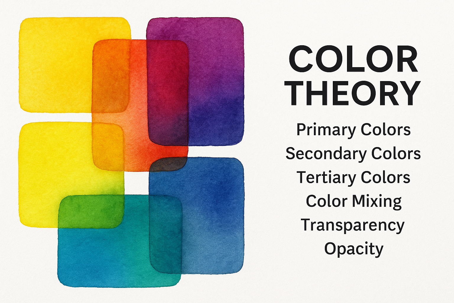
- Primary colors — red, yellow, blue — cannot be mixed from others.
- Secondary colors — orange, green, violet — are created by combining primaries.
- Tertiary colors bridge the space between, offering subtle temperature and emotional variation.
For the painter, the wheel is less about memorization and more about navigation. Knowing where a hue sits on the wheel helps you predict how it will mix, mute, or intensify when paired with its opposite.
🔥 2. Warm and Cool: The Temperature of Light
Temperature is emotional as much as visual.
- Warm colors (reds, yellows, oranges) advance toward the viewer — they carry energy and proximity.
- Cool colors (blues, greens, violets) recede — they suggest distance, air, and calm.
But temperature is relative. A yellow-green can feel cool beside a warm orange, yet warm against ultramarine. The realist painter learns to see contextually, not absolutely.
Mastering this balance allows you to model light and shadow convincingly — a cool note in a shadow gives life to the warmth of illuminated flesh or landscape.
⚖️ 3. Value and Contrast: The Architecture Beneath Color
No color decision matters more than value — the lightness or darkness of a hue.
Value creates form; color simply gives it personality.
To test your composition, squint or desaturate a photo of your painting — if it reads clearly in grayscale, your values are working.
For realistic painting:
- Keep mid-values broad and subtle.
- Reserve darkest darks and lightest lights for focal points.
- Remember: color harmony collapses without value structure.
🌈 4. Complementary Colors: The Power of Opposition
Every color has a complement — its opposite on the wheel (e.g., blue–orange, red–green, yellow–violet).
When placed side by side, complements intensify each other. When mixed, they neutralize into grays or rich earth tones.
Realists use complements to:
- Control saturation and prevent garishness.
- Create naturalistic shadows (a touch of burnt sienna into ultramarine).
- Build balanced harmony — warmth meets coolness, intensity meets calm.
This is where mastery lives: in knowing how far to push tension without breaking harmony.
🧪 5. Pigment Behavior: Transparency, Staining, and Granulation
Color theory in realism isn’t just about optical color — it’s about material color.
Each pigment carries unique traits:
- Transparency – vital for glazing (e.g., Quinacridones, Phthalos).
- Opacity – useful for covering or reshaping form (e.g., Cadmiums, Earth tones).
- Granulation – creates texture and atmosphere (e.g., Ultramarine, Cobalt).
- Staining strength – determines how easily a pigment lifts or dominates a mix.
Painters working in watercolor or oil must know their pigments like instruments — the difference between harmony and mud often lies in a single molecule.
🧠 6. Harmony and Limitation: The Wisdom of Restraint
A limited palette teaches more than a crowded one ever could.
By choosing one warm and one cool version of each primary, plus a few earths, you can mix nearly every color found in nature.
Example palette for classical realism:
- Warm Yellow: Indian Yellow
- Cool Yellow: Azo Yellow
- Warm Red: Venetian Red
- Cool Red: Quinacridone Rose
- Warm Blue: Ultramarine
- Cool Blue: Phthalo Blue
- Neutrals: Burnt Sienna, Raw Umber, Payne’s Gray
Harmony arises when your pigments share temperature logic — not just hue.
💡 7. Color and Emotion: The Painter’s Subtext
Color isn’t merely descriptive; it’s expressive.
The same gray-green can feel tragic or peaceful depending on value and contrast.
A luminous ochre can evoke sunlit serenity or nostalgic decay.
In realism, this emotional charge is subtle but deliberate. The color of your shadows, your reflected lights, even your background temperatures — all quietly shape what the viewer feels before they think.
✍️ Conclusion: Painting with Understanding
Color theory, for the realist painter, isn’t about rules — it’s about clarity.
It helps you see more than mix, to anticipate how pigments will speak to each other in light.
When color becomes a language rather than decoration, your painting moves from surface beauty to something deeper — the quiet conversation between light, form, and truth.
