

Every artist eventually discovers that great painting begins with great materials — not expensive ones, but dependable tools that behave predictably and support technique. This guide outlines the essential watercolor supplies for painters who want to achieve luminous, realistic results.
I’ll share what I personally use in my studio and offer professional-quality alternatives that perform equally well. The following is a link to most of my supplies on Amazon.
🎨 1. Watercolor Paints — The Heart of the Palette
I use M. Graham watercolors for their rich honey-based formulation and effortless rewetting. They remain vibrant and transparent even after drying, which is critical for glazing and realism.
My colors are organized in the Stephen Quiller palette system, grouping warm and cool hues around the color wheel with a section of earth tones for texture and grounding.
Essential Colors for a Realist Palette
A well-balanced palette begins with three yellows, three reds, three blues, and a set of earth tones.
Essential Colors (Single-Pigment & Transparent Preferred)
-
- Ultramarine Blue (PB29) – warm, granulating blue
-
- Cobalt Blue (PB28) – clean, non-staining sky blue
-
- Phthalo Blue (PB15:3) – intense, transparent cool blue
-
- Quinacridone Rose (PV19) – transparent primary red substitute
-
- Permanent Alizarin Crimson (PR177) – deep, transparent crimson
-
- Azo Yellow (PY151) – clean, bright primary yellow
- Hansa Yellow Deep
- Deep Gold: Quinacridone Gold (PO48 + PY150) – transparent amber glaze for sunlight, brass, and late-afternoon warmth.
- Azo Yellow (PY151) – clean, bright primary yellow
-
- Dix Purple (Pv23)
- Raw Sienna (PBr7) – warm, earthy yellow
- Dix Purple (Pv23)
-
- Burnt Sienna (PBr7) – essential earth tone for neutrals and shadows
-
- Transparent Red Oxide (PR101) – textured, granulating warm brown
-
- Sap Green (blend) – natural greens for foliage
-
- Neutral Tint or Payne’s Gray – mixing darks without deadening color
- Neutral Tint or Payne’s Gray – mixing darks without deadening color
These colors will mix nearly any realistic tone while maintaining clarity and luminosity.Cool: Azo Yellow (PY151) – brilliant, transparent lemon yellow perfect for mixing clean greens.
Alternatives: Daniel Smith Hansa Yellow Light (PY3), Schmincke Transparent Yellow (PY150).
Warm: Indian Yellow (PY110) – radiant, sun-warmed tone that glazes beautifully for skin, foliage, or light effects.
Alternatives: Daniel Smith Indian Yellow (PY110), Schmincke Indian Yellow (PY110).
All colors are single-pigment when possible — this ensures cleaner mixes and more predictable glazing results.
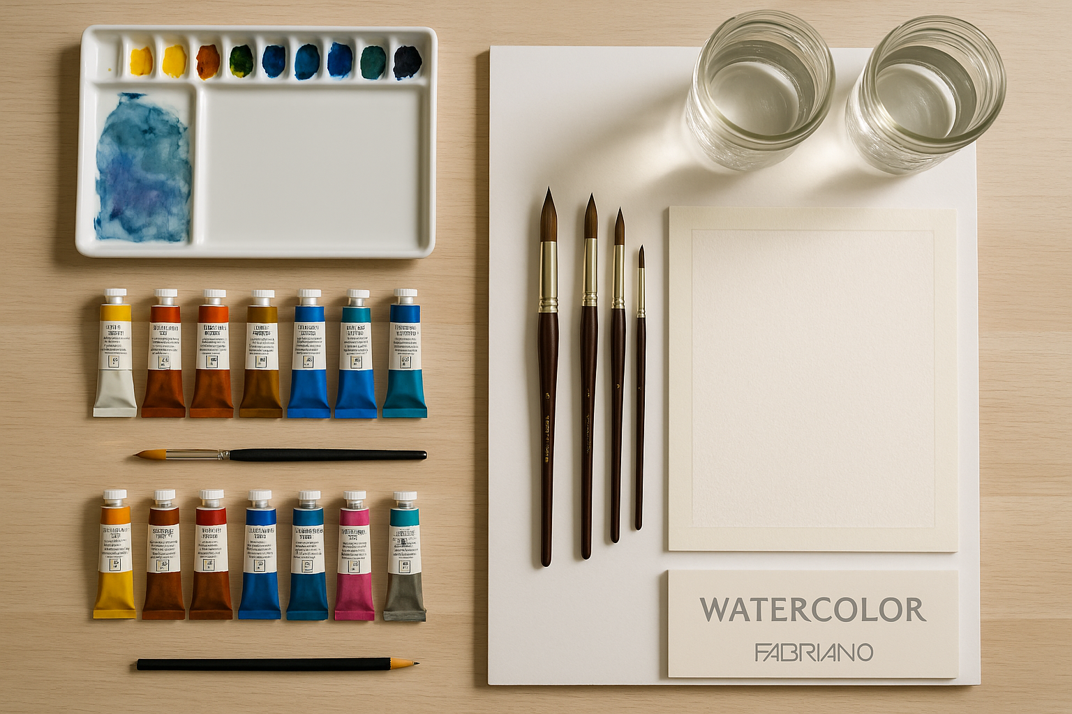
🖌️ 2. Brushes — Precision and Control
I use Escoda Reserva Kolinsky sable brushes for their balance, control, and water capacity. They spring back cleanly and make precise marks for realism. My core set includes:
-
- Rounds: sizes 2, 4, 6, 8, 12
-
- Flats: ½″ and 1″
-
- Scrubbers: firm synthetics for lifting pigment and highlights
Professional alternatives:
-
- Da Vinci Maestro Series 10 (Sable)
-
- Princeton Aqua Elite (Synthetic Sable)
-
- Silver Brush Black Velvet (Synthetic Blend)
Illustration Marker: [Insert close-up photo of round, flat, and scrubber brushes with labeled sizes.]
🧩 3. Palette — Your Color Workshop
I paint with a Quiller porcelain palette, arranged by color temperature with a separate area for granulating earth tones. Porcelain keeps colors clean and prevents staining.
High-quality alternatives:
-
- Mijello Fusion Air-Tight Palette – travel-friendly option
-
- Enamel butcher tray – traditional and easy to clean
-
- Masterson Sta-Wet Palette – keeps paints moist for longer sessions
💧 4. Water and Cleaning
Two water containers are essential:
-
- Jar 1: for rinsing brushes
-
- Jar 2: for clean water to mix fresh washes
I use Mason jars because they’re sturdy, wide-mouthed, and transparent.
Pair them with non-textured kitchen paper towels — I use these constantly for lifting pigment, adjusting moisture, and softening edges.
Alternatives:
-
- Plastic brush washers with spring coils
-
- Stainless steel rinse jars
📜 5. Paper — The Foundation of Realism
I use Fabriano Artistico Soft Press 300 lb paper — 100% cotton, acid-free, with just enough texture for pigment movement while still allowing fine detail. It sits between hot and cold press and is my ideal surface for glazing and controlled washes.
Equivalent-quality options:
-
- Arches Cold Press 140/300 lb (300 gsm) – classic, durable surface
-
- Saunders Waterford Cold Press 140/300 LB – subtle texture and excellent lifting
-
- Hahnemühle Cézanne 140/300 lb– bright white and consistent surface sizing
Always work on professional-grade paper — cheaper cellulose paper buckles, pills, and dulls color vibrancy.
🪶 6. Mounting Board and Tape
I tape my paper to foam core board — it’s lightweight and inexpensive but stiff enough to prevent warping.
Alternatives:
-
- Gatorboard – water-resistant and more durable
-
- Masonite panel (sealed) – reusable and rigid
Use artist’s tape or low-tack masking tape (Drafting tape) for crisp edges and easy removal.
🧺 7. Other Studio Essentials
-
- Spray bottle: to rewet pigments or keep washes active
-
- Kneaded eraser: for light lifting without damaging the paper
-
- Soft cloth: reusable option for wiping brushes or cleaning surfaces
-
- Pencil (2H or HB): light enough to erase after painting
-
- Compact travel kit: for plein air or quick studies
🎨 8. My Palette Philosophy
My Quiller palette isn’t about having every color — it’s about understanding relationships.
Transparent, single-pigment paints reveal light; granulating earth tones add texture and atmosphere.
In realism, these subtleties make the difference between paint on paper and light made visible.
✍️ Conclusion
Every brushstroke begins long before paint hits paper — it starts with choosing the right tools.
My setup — M. Graham paints, Escoda brushes, Quiller palette, Fabriano Artistico Soft Press paper, and Mason jars — offers consistency and control, but any artist-quality equivalent will serve you just as well.
Focus on transparency, patience, and precision.
Let the materials become invisible, so what remains is light, color, and truth.
