

There are few things in art that sound more mystical than the “Golden Mean.” It whispers of Renaissance geniuses, secret ratios, and compositions that feel just right—even if you can’t quite say why. Whether you’re laying out a watercolor still life or plotting a grand oil painting, this ancient proportion has quietly guided artists for centuries. Let’s unravel its magic.
✨ What Exactly Is the Golden Mean?
The Golden Mean (also called the Golden Ratio or Divine Proportion) is a mathematical relationship often expressed as: ϕ=1+52≈1.618\phi = \frac{1 + \sqrt{5}}{2} \approx 1.618ϕ=21+5≈1.618
This ratio appears all over the natural world — in nautilus shells, sunflower spirals, pinecones, hurricanes, and even galaxies. The human eye instinctively recognizes this proportion as harmonious. Architects, sculptors, and painters have used it to give their work a sense of balance that feels both structured and organic.
🏛 A Brief Stroll Through Art History
- Ancient Greece: The Golden Mean shows up in the Parthenon’s design, influencing proportions of columns, friezes, and façade layout.
- Renaissance Masters: Artists like Leonardo da Vinci, Piero della Francesca, and Albrecht Dürer integrated the Golden Mean into compositions to mirror the mathematical order of God’s creation. Leonardo’s Vitruvian Man is practically a love letter to φ.
- Baroque & Beyond: Painters like Nicolas Poussin and later academic artists used golden rectangles to structure landscapes, figure groupings, and architectural backgrounds.
🧭 Using the Golden Mean in Painting Composition
The Golden Mean isn’t a rigid rule — think of it as a well-tuned compass rather than a measuring stick. Here are a few ways painters weave it into their work:
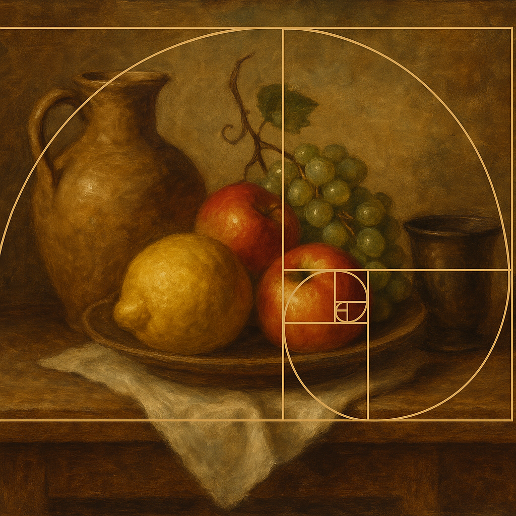
1. Golden Rectangles and Spirals
Draw a rectangle whose sides are in the 1:1.618 proportion. Inside it, inscribe a series of smaller golden rectangles, each rotated, to create a logarithmic spiral. This spiral naturally leads the viewer’s eye through the painting — perfect for landscapes, narrative works, or still lifes with a focal point.
Pro Tip: Place your main subject at or near the spiral’s focal point. It’s like giving your viewer GPS coordinates for where to look first.
2. Golden Section Lines
Divide your canvas vertically and horizontally according to the golden ratio (about 61.8% across and down). The intersections of these lines are often more dynamic than dead-center placement — similar to the Rule of Thirds, but more mathematically elegant. This technique works wonders for portrait placement, horizon lines, or key objects.
3. Balancing Large and Small Masses
The Golden Mean can guide the ratio between large and small shapes in your composition. For example, a major mass (say, a dark foreground tree) might occupy roughly 61.8% of the horizontal space, with the remaining 38.2% balancing it through sky, architecture, or secondary figures.
🧠 Golden Mean vs. Rule of Thirds
Think of the Rule of Thirds as a quick sketch; the Golden Mean is the blueprint beneath a cathedral ceiling. The thirds grid is easier to apply and often “close enough” for strong compositions. The Golden Mean, however, provides a more nuanced and naturally pleasing structure — especially valuable in classical or formal works.
Many artists use both: they sketch with the Rule of Thirds to block in shapes quickly, then refine using Golden Mean overlays to tighten the composition.
🖼 Modern Application (Yes, Even Digital Artists!)
You don’t need to be Leonardo with a compass. Today, many painting apps (Procreate, Photoshop, Krita) offer Golden Ratio overlays. Traditional painters can just as easily use a transparent acetate grid or lightly pencil in golden sections on the canvas during the planning stage.
Whether you’re working on a luminous watercolor still life or a monumental oil painting, incorporating φ can give your work an underlying sense of inevitability — like the composition was meant to be.
🌻 Closing Thoughts
The Golden Mean isn’t a creative straitjacket — it’s a rhythm. Nature hums to it, great masters composed with it, and your next painting can quietly resonate with its harmony. Use it boldly, or weave it subtly into your structure. Either way, your viewers will feel the difference, even if they can’t name it.
