

Watercolor painting begins long before the first brush touches the surface. It begins with the paper — a living material that breathes, absorbs, and responds. Every wash, every bloom of pigment, every delicate edge depends on how that paper is made and how it has been sized.
What is Sizing?
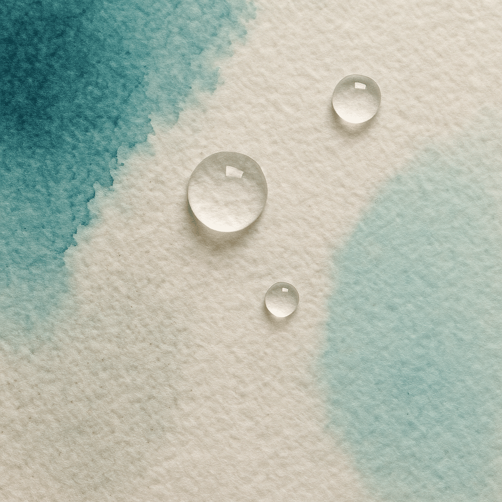
Sizing is a treatment added to watercolor paper to control how water and pigment absorb into the fibers. Without it, paint would sink too deeply, dulling colors and making crisp edges impossible. With the right balance, the surface resists just enough — allowing luminous washes, soft blends, and confident brushwork.
There are two kinds of sizing that most artists encounter: internal sizing and surface (or external) sizing.
Internal Sizing
Internal sizing is added within the paper pulp during manufacturing. It becomes part of the paper itself — a subtle barrier woven into every fiber. Its purpose is to slow water absorption throughout the sheet, giving the artist time to manipulate washes and lift color before it stains too deeply.
This internal control keeps paper strong when wet and prevents it from turning to pulp under heavy glazing or scrubbing. Most modern watercolor papers use neutral or synthetic sizing agents such as alkyl ketene dimer (AKD) or rosin-alum, though historically, gelatin was used even inside the pulp.
Internal sizing affects the character of a paper:
- Heavier internal sizing = slower absorption, more controlled washes
- Lighter internal sizing = faster absorption, softer edges and blooms
A well-balanced paper lets the pigment sit gracefully at the surface without feeling slick or overly resistant.
Surface (External) Sizing
Surface sizing — sometimes called “tub sizing” or “surface gelatin sizing” — is applied after the paper sheet is formed and dried. The sheet is either dipped (“tub sized”) or coated (“surface sized”) with a thin layer of gelatin or synthetic resin.
This outer skin is what you feel when you run your hand over a sheet of Arches or Fabriano Artistico — that slight drag beneath the fingers. Surface sizing determines how paint initially behaves: whether the wash glides or grabs, whether a brushstroke settles in place or spreads outward.
- More surface sizing = paint sits longer on top, ideal for lifting and glazing
- Less surface sizing = faster absorption, ideal for expressive wet-in-wet techniques
Together, internal and surface sizing form a delicate balance between control and spontaneity.
Why Sizing Matters
Every watercolorist develops an instinct for how their paper reacts — but those reactions trace back to sizing. It governs:
- Brightness and contrast: By keeping pigment near the surface, colors stay vibrant.
- Edge control: It defines how soft or crisp transitions appear.
- Paper durability: Sizing strengthens fibers, allowing for multiple washes or corrections.
Over time, sizing can deteriorate, especially if paper is stored in humid environments or exposed to oils from handling. Old or poorly stored paper may absorb unevenly, leading to blotchy washes — a reminder that even invisible chemistry shapes our visual world.
Choosing and Testing Paper
Before committing to a brand or batch, it’s worth testing how your preferred pigments behave:
- Draw a small square wash — see how far water spreads before it settles.
- Try lifting a stroke — does pigment rise easily, or has it stained the fibers?
- Observe color clarity — vibrant surface color suggests healthy sizing.
Each manufacturer has its own secret balance. Arches, Saunders Waterford, Fabriano, and Hahnemühle all treat sizing differently — which is why two 100% cotton papers can feel utterly distinct.
A Living Surface
Good watercolor paper is never just a blank substrate — it’s a field of dialogue between fiber, water, and pigment. Sizing, though invisible, sets the tone for that conversation.
Too much, and the paint skates away. Too little, and it sinks into silence.
The art lies in finding harmony — in choosing a paper whose voice matches your own.
