

Color seduces the eye — but value builds the image.
Without correct value relationships, even the most exquisite pigments collapse into confusion. For realist painters, value (lightness and darkness) defines structure, depth, and atmosphere long before hue plays its part. Contrast — the relative difference between values — determines the painting’s rhythm, focus, and emotional charge.
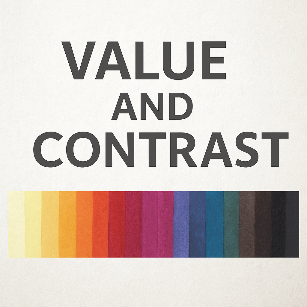
🎨 The 24-Color Value Palette
Below is a balanced palette arranged from lightest to darkest by perceived value, not hue intensity.
Each color holds a specific role within a value structure — how light or dark it reads in grayscale determines its compositional importance.
| Category | Color | Pigment Code | Typical Value |
|---|---|---|---|
| High Values (Lightest) | Lemon Yellow (PY175) | 9.5 | |
| Hansa Yellow Light (PY3) | 9 | ||
| Naples Yellow (PBr24) | 8.5 | ||
| Yellow Ochre (PY43) | 8 | ||
| Buff Titanium (PW6:1) | 7.5 | ||
| Mid-High Values | Quinacridone Gold (PO49 + PY150) | 7 | |
| Raw Sienna (PBr7) | 6.8 | ||
| Permanent Orange (PO62) | 6.5 | ||
| Cobalt Turquoise (PB36) | 6.3 | ||
| Sap Green (Blend) | 6 | ||
| Middle Values | Cobalt Blue (PB28) | 5.8 | |
| Phthalo Blue (PB15:3) | 5.5 | ||
| Viridian (PG18) | 5.2 | ||
| Quinacridone Rose (PV19) | 5 | ||
| Burnt Sienna (PBr7) | 4.8 | ||
| Mid-Dark Values | Permanent Alizarin Crimson (PR177) | 4.3 | |
| Ultramarine Blue (PB29) | 4 | ||
| Transparent Red Oxide (PR101) | 3.8 | ||
| Payne’s Gray (PBk9 + PB15) | 3.5 | ||
| Dioxazine Purple (PV23) | 3.2 | ||
| Darkest Values | Indigo (PB60 + PBk6) | 2.8 | |
| Sepia (Blend) | 2.5 | ||
| Neutral Tint (PBk6 + PV19) | 2.3 | ||
| Ivory Black (PBk9) | 1.8 |
Illustration Marker: [A visual palette strip of these 24 colors arranged from lightest value (left) to darkest (right), each labeled with color name and pigment code.]
⚖️ Value Before Hue
When seen in grayscale, Lemon Yellow and Phthalo Blue appear nearly opposite — one luminous, one heavy — yet both are equally vivid in color. This proves that color intensity does not equal value.
Painters who think only in hue risk misjudging relationships that determine light and form.
🎨 Exercise:
Convert your painting photo to black-and-white. If the structure holds, your value plan works; if it collapses, the hues were deceptive.
🔳 Contrast as Structure
Contrast creates hierarchy — the eye always moves toward the greatest difference.
High-contrast pairings (e.g., Burnt Sienna against Ultramarine Blue, or Lemon Yellow against Payne’s Gray) create energy and focal tension. Low-contrast transitions (e.g., Raw Sienna into Naples Yellow) convey atmosphere and subtle gradation.
Use contrast deliberately:
- Hard contrast: Defines focal points, metal, and light reflections.
- Soft contrast: Suggests distance, shadow, and the quiet diffusion of light.
🧠 The Optical Truth of Value
Human perception is nonlinear: our eyes are more sensitive to midtones than to extremes of light or shadow.
This means a small jump in value in the middle range appears more dramatic than an equal jump in highlights.
Painters exploit this — compressing highlights and deepening shadows to create optical realism.
🖌️ Essential Pigments for Value Contrast
Certain pigments naturally enhance value structure because of their tinting strength and transparency:
- Ultramarine Blue (PB29) – establishes dark structure without deadening mixtures.
- Transparent Red Oxide (PR101) – produces rich, natural neutrals.
- Quinacridone Rose (PV19) – maintains luminosity in darks.
- Raw Sienna (PBr7) – excellent mid-value warm.
- Payne’s Gray (PBk9 + PB15) – reliable mixer for low-key palettes.
- Titanium White (PW6) – highest reflective pigment; handle with restraint.
✨ Conclusion: Seeing in Value
Color theory begins in light, but mastery begins in value.
By organizing your palette not by hue but by brightness, you gain control over the visual architecture of your work. In realism, contrast is not simply dramatic effect — it is how form breathes, how space reads, and how emotion is translated into light.
